Activity 3. Samples Generator (Random Sampling Techniques)

[b]1. [/b][b]Choose the Sampling Method[/b][br][list][*]Use the dropdown menu to select the type of random sampling you want to use (e.g., simple, stratified, cluster).[/*][/list][br][b]2. Set the Parameters[/b][br]Based on your chosen sampling method, enter the required numbers:[br][list][*]Population size[/*][*]Sample size[/*][*]Number of clusters (for cluster sampling)[/*][*]Number of sample clusters (for cluster sampling)[/*][*]Number of strata (for stratified sampling)[/*][*]Population and sample size for each stratum(for stratified sampling)[br][br][/*][/list][b]3. Generate the Sample[/b][br][list][*]Once all the necessary values are set, click the "Generate Sample" button.[br][br][/*][/list][b]4. View the Results[/b][br][list][*]A table will appear showing the generated samples based on your selected method and inputs[/*][/list]
Activity 4.1 Frequency Table

[*]Type or copy and paste the data set into [b]Column A[/b]. [i](Note: This applet can handle up to 100 rows of data in Column A.)[/i][br][/*][*][i][br][/i][/*][*]Construct the [b]Frequency Table[/b] by following the steps below:[br][list][*]Determine the number of classes.[/*][*]Identify the class boundaries.[/*][*]The applet will automatically calculate the frequency for each class.[/*][/list][/*][br][*]After constructing the frequency table, [b][i]answer the questions below[/i][/b].[br][/*]
Understanding the Data
What information is being represented in the frequency table, and why is it important to organize this data?
Organizing the Data
How did you determine the class intervals or the number of classes?
Interpreting the Data
What patterns or trends did you notice in your dataset after organizing it into a frequency table?

Activity 5.1 Constructing a Pie Graph

Your Task
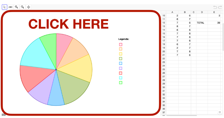
Group A aims to learn about the [b][i]everyday sleeping habits[/i][/b] of students in their Grade 7 batch. To investigate this, they conducted a survey of their batchmates' daily sleeping hours. Their sample consisted of two (2) sections from their batch. They randomly selected 20 students from each section, out of the 45 students in each section.[br][br]The spreadsheet below displays the typical daily sleeping hours of the students in their sample for each section.[br][br]Your task is to create a[b][i] data representation[/i][/b] that will help you analyze and gain insights into the students' daily sleeping hours.[br][br]Afterward, [b][i]answer the questions below.[/i][/b][br][br]Additionally, [b][i]a tutorial [/i][/b]on constructing a pie graph using this applet is provided below.
Section A
Section B
Representing Data
What are the details of the data representations did you use and/or consider in your construction of the graphs?
Representing Data
Is this data representation an effective choice for presenting the data? Why or why not?
Interpreting Data
What information about the daily sleeping hours during school days of students did you get from the data representations you constructed?
Interpreting Data
How do the daily sleeping hours of Section A compare to the daily sleeping hours of Section B?
[size=200]How to Construct a [b][color=#b45f06]Pie Graph[/color][/b] in GeoGebra[/size]
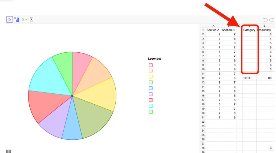
[b][color=#1155cc]Step 1:[/color][/b] Determine the [b][i]categories[/i][/b] you will use in organizing the data. [b][i]Input[/i][/b] it in the column for [b][i]Category[/i][/b]. See Figure 1.
[i][center][/center][center][/center][/i][i][center][/center][/i][size=150][size=100][i][center]Figure 1[/center][/i][/size][/size]
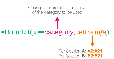
[b][color=#1155cc]Step 2:[/color][/b] To determine the [b][i]count[/i][/b] for each category, [b][i]click the cell [/i][/b]beside your category, then input this [b][i]command [/i][/b](See Figure 2)
[i][center][/center][center][/center][/i][i][left][/left][/i][size=100][right][/right][/size][left][size=100][/size][/left][center][i][/i][/center][size=100][center][i]Figure 2[/i][/center][/size]
For example, to determine the[color=#a64d79] [b][i]count of 1[/i][/b][/color] in [b][i][color=#b45f06]Section A[/color][/i][/b] and [b][i][color=#a64d79]count of 2[/color][/i][/b] in [b][i][color=#b45f06]Section A[/color][/i][/b], use these commands (See Figure 3)[br][br]Note: Do NOT DELETE the temporary frequency, just EDIT.
[i][center][/center][center][/center][/i][i][center][/center][/i][size=100][i][center]Figure 3[/center][/i][/size]
[b][color=#1155cc]Step 3:[/color][/b] To edit the [b][i]legends[/i][/b], follow the steps below:
[list][*]Click the squares that are NOT needed, then click delete. Do the same with the text besides that square that are not needed. [/*][/list]
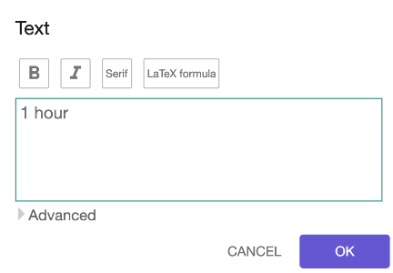
[list][*]Click on the Graphics view, [i][b]the left side view [/b](See Figure 4)[/i], and click [i]Text [icon]/images/ggb/toolbar/mode_text.png[/icon][/i]tool. Then, type the text [i](See Figure 5)[/i].[/*][/list]
[i][center][/center][/i][size=100][i][center]Figure 4[/center][/i][/size]
[i][left][/left][/i][size=100][i][left][/left][/i][/size][center][size=100][i][/i][/size][/center][left][i][/i][/left][size=100][left][i][/i][/left][/size][i][size=100]Figure 5[/size][size=100][left][/left][/size][/i]
Optional:
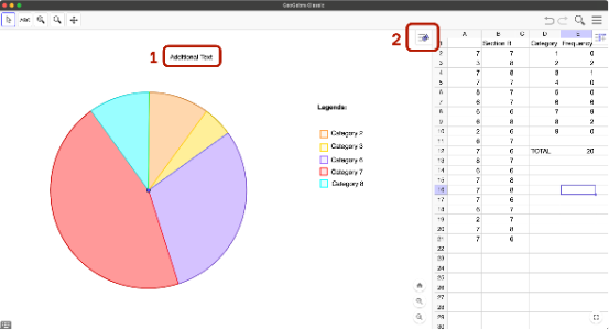
[list][*][size=100]If you want to [b][i][color=#a61c00]add other texts[/color][/i][/b], such as title or additional explanations, you can use the[b] [i]Text [icon]/images/ggb/toolbar/mode_text.png[/icon] tool[/i].[/b] [/size][/*][/list][list][*][size=100]Click the [b][i]Move tool[/i][/b] and adjust the position of the text.[/size][/*][/list][list][*][size=100]To [/size][b][i]change the style of your text[/i][/b], click the text you want to customize and click [b][i]Style menu[/i][/b]. ([i]See Figure 6)[/i][/*][/list]
[i][left][/left][/i][size=100][center][i][/i][/center][left][i][/i][/left][/size][center][/center][size=100][center][/center][left][i]Figure 6[/i][/left][/size]

Activity 6. Analyzing Data: Number of Visitors in the Philippines from 2023 to 2025

The applet displays data on the[b] number of visitors to the Philippines from January 2023 to April 2025[/b], coming from the top countries with the highest number of visitors. [br][br]You can view the graphs for each country by clicking the [b]"Show Graph"[/b] button and selecting the checkboxes for the countries you want to display. [br][br]There's also a dropdown menu in the top-right corner that lets you [b]choose the time period [/b]you want to view. [br][br]The graph also shows the[b] average number of visitors for the selected duration[/b].
What [b][i]overall trend [/i][/b]do you notice in the number of visitors to the Philippines from 2023 to 2025?
Which [b][i]month had the highest number of visitors[/i][/b] in any given year, and how does that [b][i]compare across the three years[/i][/b]?
What patterns can you observe about the number of visitors during certain months or seasons?[br][i]Are there months when tourism always goes up or down?[/i]
If you were in charge of promoting tourism, how would you use this data to help bring in more visitors?
If the trend continues, what do you think will happen to the number of visitors in 2026?

Information